Context
Miki is a Japanese motion designer and photographer based in Tokyo. Her recent projects have been focused on layering on different themes, like for example “smoke” and “nature”. Using a combination of digital manipulation and double exposure photography, she creates tension between the two realities she’s portraying. She allows portraits to revel her inner feelings. She does different types of photographs that have different themes. For example she has “urban sense” and “nature sense”. The urban space opens itself up toan invisible sense of emotion, before absorbing the very same. The poetic sides of the shots portray a narrative of city life. She has photos of the city in the night time, when all lights are visible. She then blends it with a self-portrait. The reason why she does this is because it is shown that are both moving and remarkably expressive. Her landscape and portrait merge smoothly into one another to produce a gentle melancholy. In her photos you only recognise the face of the model; she does this to give a mysterious effect. The result is a surreal style of art that is intriguing as well as beautiful.
Analysis

what can I see-
The genre of this photograpgh is both portrait and landscape combined together. The girl is the portrait and the street is the landscape. In this photograpgh I can see a photo of a girl looking outside the window with a while veil covering the window. Also I can see how there is a photograpgh of a road, which was taken at night time, and both photograpgh blended in together. The second photo covered most of the girls facial features. This means that the first photograph of the girl looking out the window, I assume that it is more dominant. I can how the lights on the cars are really standing out, also in the picture I can tall buildings in the buildings. Also when looking closely at one of the cars, you can see how some of the cars kind of blurry, or have a moving motion to it. So I assume that the photograpgh was taking while "on the go".
So when looking at the center of the photo you can see the layer of the second photograpgh. To the left of the photograpgh you can see the white curtains which cover the window. So you can't really see outside of the window.
Feelings and Mood-
This photograpgh reminds me of basically London at time time. Where all of the car lights are beaming out and how all of the tall buildings have lighted up. Making the area look attractive. I think that this photograpgh looks really decent and the quality of it looks really good. That was the reason why I choose to analysis this photograpgh. This photograpgh creates a positive feeling and mood.
I liked the way she combines different types of photographs together, I think that is why I find it very interesting.
Composition-
It's very hard to make a decision if this photograph is asymmetrical or symmetrical. But since it isn't symmetrical, becasue if it was, then everything would be the same on each sides, Like a reflection. So I think that it might be asymmetrical. When looking at this photograpgh, firstly my eyes looked towards where the blending of image occurred. This is means at the middle of the photograpgh. Maybe because it looks like the most busiest and attracting side of the whole photograpgh. Secondly, my eyes looked at the right hand side. The reason for that is because the white color was the color that was the most dominating.
Color and mood-
In the photograpgh I can see, not a lot colors used, becasue the colors are all mainly the same. For example the color red from the lights from the car. The dark and blueish color from the lights on the buildings. The shadowy color from the girls face and lastly the white from the curtain. I think that the colors give a casual mood, this is becasue it is what we see almost everyday, so it isn't abnormal to us. I think that the dominant color is the light plain white color of the curtain.
Light and tone- I think that light is coming from the right hand side, basically the direction the girl is looking at. I can tell becasue it seems more brighter in that area, so I think that it the light is beaming from that area.
What I have learnt-
I have learnt how to use the idea of my artist by combining different type of photographs together to make it look interesting.
I have also learnt how to make sure that the quality of my work is very good, so that when combing together it would come out really good.
Lastly overall I have learnt how to make bring out a certain mood by combing two photos using levels.
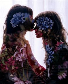
What can I see-
|
This genre of photograph is both landscape and portrait, but however it put together is in a portrait style. The flowers in the theme of "natural". In this picture, there is two different photos combined together. One of the photograph is the background of flowers, and the other is a picture of two girls sitting facing each together. The background is a white transparent curtain that has light shunning through. On the left of the picture, it is one of the girls sitting down putting her head on the other girl. You can also see, a the picture of the blue and pink flowers. In the center of the picture, you can see only see the white curtain. You can't rally see the facial faces of the girls, but however you can see a blue flower where their head is going to be.
Feelings and Mood
Miki's work is said to bring out her inner feeling. Which is exactly how this makes me feel. Also a flower can be seen as an object of beauty, this brings out a happy and positive feeling. And it brings my mood in an uplifting way.
Composition-The balance of this photograpgh is asymmetrical, since it doesn't look like a reflection. This is similar to the previous photograph. When I first looked at this picture I was attracted to the blue flowers that is layered on both of the girls head. This is mainly becasue, it is very bright which makes it stand out. Secondly, I was attracted to the bottom half of the photograpgh, this is becasue, of the colors of the flowers. They are bright colors and it makes that side of the photograpgh look very detailed.
|
Color and mood-There are many colors used in this picture. For example, blue, pink, green and red. Those are the colors of the flowers. The background has a faint white color. The use of he bright colors creates a bright feeling. It is said that the color pink represents compassion, nurturing love. This can relate to the position the girls are. The color red is an attracting color so its gives a bright mood.
Light and ToneWhen looking at this photograpgh, you can see that the light is coming from the background. Also the colors of the curtains ae white, which makes the dark shade of the girls stand out. This color had a light tone, this is due to the light background.
What have I learnt-After analyzing my artist work, I have learnt some things-
|
